Telstra Enterprise
A redesign of the Telstra Enterprise internal design website, with a focus on rearranging information architecture
Please note that information and screenshots may be omitted for privacy reasons.
★ Context
As part of my time in the Summer Vacationer Program within the Product & Service Design stream in Telstra, I was tasked with supporting my fellow intern Swaetha in redesigning the internal design website for Telstra Enterprise. This is a point of reference for all designers within Enterprise as it provides standard design guidelines, design systems, shared practices, reusable components and more. However, the site had not been updated for a period of time and there were several areas requiring improvement.
★ Research
The majority of this project was centred around research, as several designers in the business had noted that the site was not user friendly but found it difficult to articulate why. Initial anecdotal evidence suggested that lack of efficient information architecture was the primary reason as users cited it as difficult to navigate and not knowing where to go for what they needed. Some small aesthetic issues also emerged through the research.
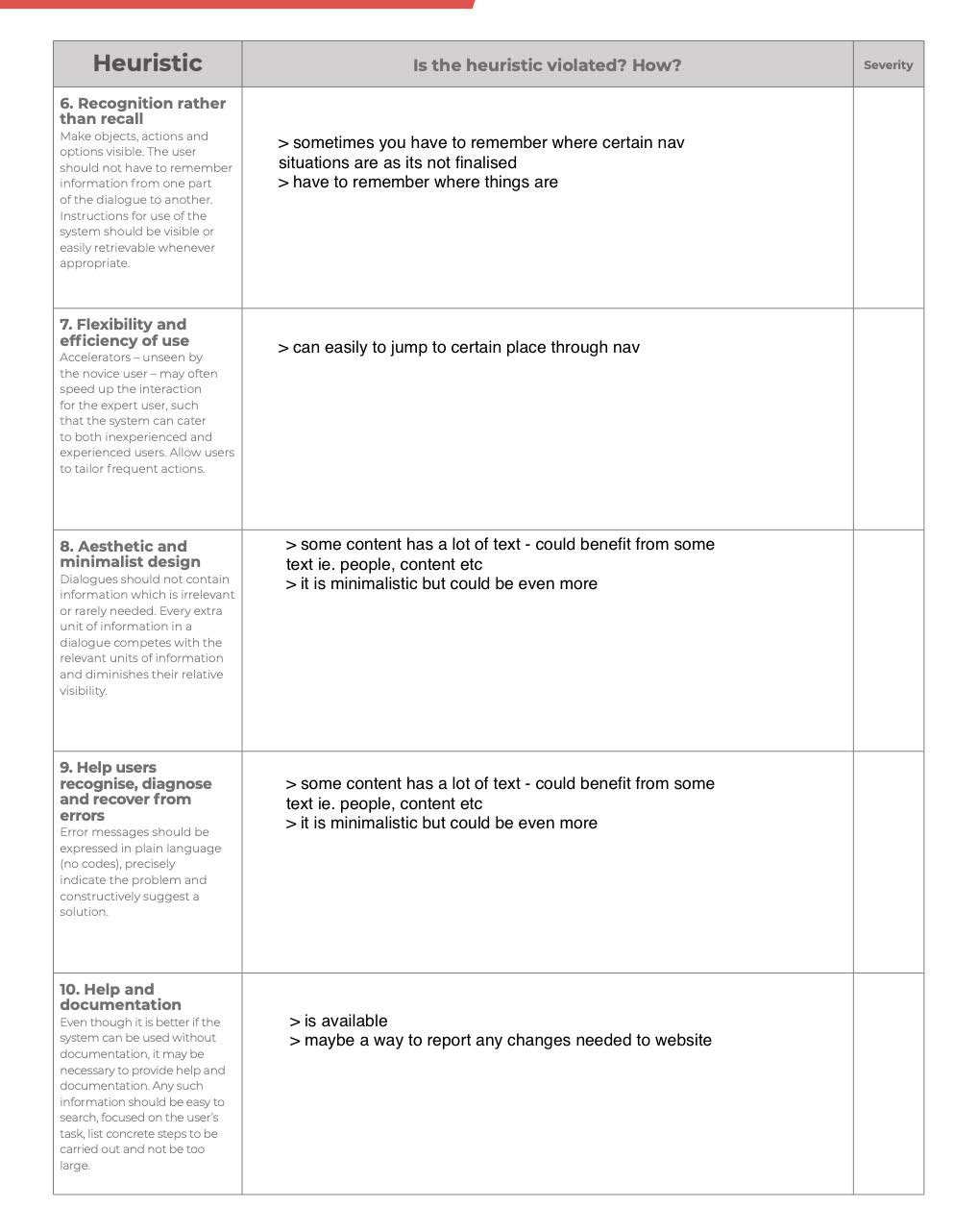
Heuristic evaluations were conducted with another designer by combing through every screen in detail together and putting sticky notes on each. A detailed psychological usability heuristics spreadsheet was adapted from 'jordisan' to consider as many psychological tendencies as possible. An overall heuristics table based on Nielsen's 10 Principles was then completed to understand which heuristics were more violated and which ones less, allowing us to understand the root of most issues and thus which priorities to tackle.
Discussing with another design intern put a spotlight on several repeated issues such as:
◦ Lack of accessibility with differing fonts, font sizes, and large blocks of text that repeat content
◦ Nonsensical organization of sidebars and tabs
◦ Scattered contacts as opposed to a collective section of contacts
◦ Inconsistent UI across the entire site
◦ Unnecessary elements e.g. a weather feature
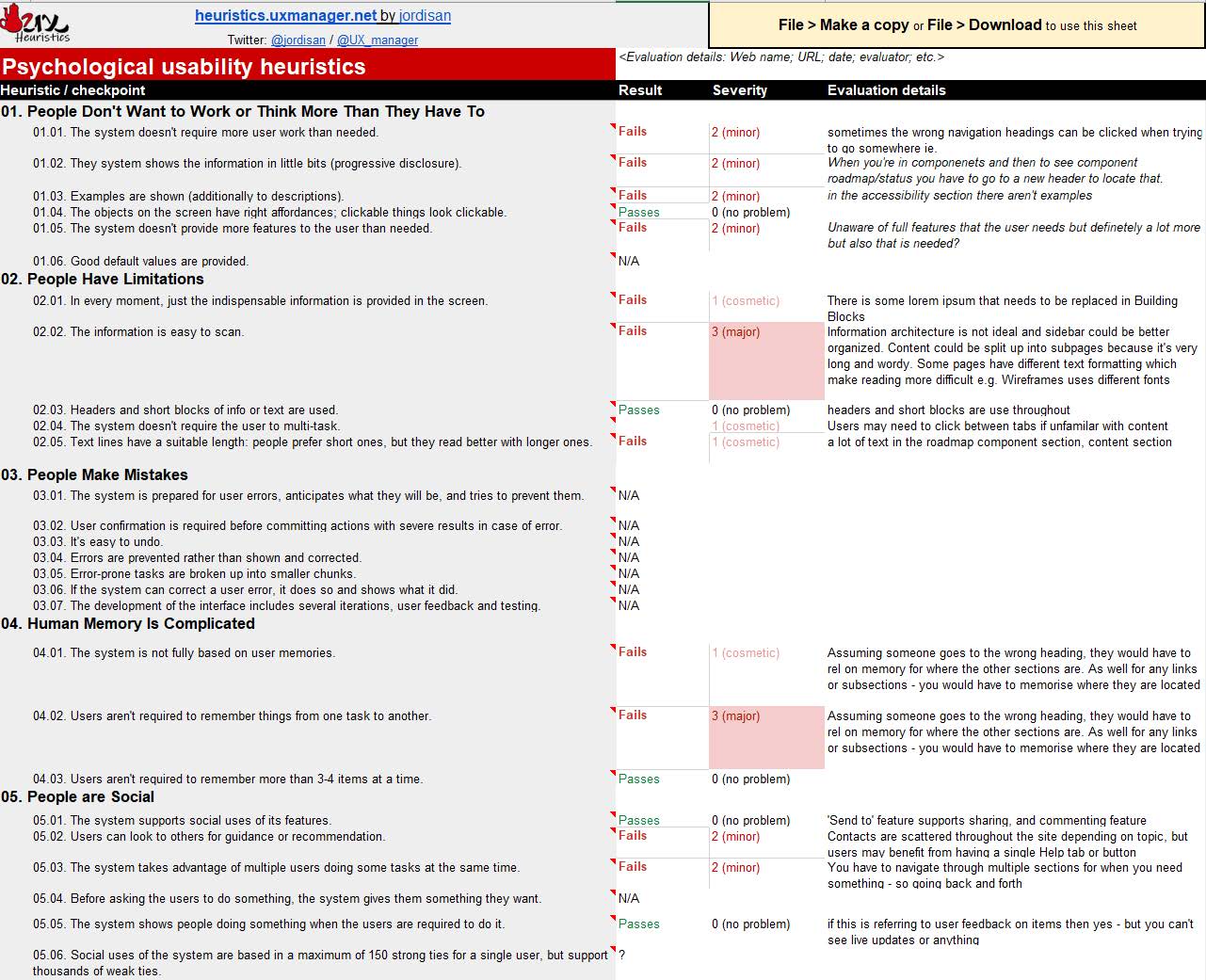
Detailed heuristic evaluation
Simple heuristic evaluation
★ Concept
A brief map of the information architecture of the site was constructed in Miro to note down the main pathways that could be taken from the home page, and the ways in which they were linked to one another. Sub pages were ignored for the time being as the purpose of this exercise was to understand the main categories. Taxonomy (a focus on organisation and hierarchy) and ontology (a focus on labelling and organising) were the values that underpinned this activity, as they were the main pain points that users found with the site.

Overview of current information architecture state
★ Ideation
The task of rejigging the information architecture of the website was undertaken by asking users to complete a card sorting exercise to understand their expectations and understanding of topics. We decided to implement an Open Card Sort in which participants were asked to organize topics from content within the website into groups that make sense to them and then name each group they created in a way that they feel accurately describes the content. This is because we wanted to learn how users group content and how they'd label them, giving them more opportunities to categorize on their own without provided labels. We sent out remote, computer-based exercises for participants to work independently as this was more conducive to a large-scale and it analyzed the data for us.
Post card sorting, we took the main labels and categories created by participants and began redesigning the information architecture in accordance. This would hypothetically make for easier search and navigation. We also made several recommendations of aesthetic changes to the site.

Redesign of information architecture
★ Design
Unfortunately, I am not able to provide images of the UI design changes that were suggested/made due to privacy reasons.
★ Learnings
I learnt a great deal in this project, particularly in relation to information architecture. In the past, I may have breezed past this dimension of design and skipped straight to categorizing areas in products in line with my own beliefs, but the card sorting revealed that there can be great variance in what people believe belongs together. My theoretical knowledge of information architecture (e.g. ontology, taxonomy, choreography) and the types of navigation that exist within choreography (global navigation, local navigation, contextual navigation) was deepened to a large extent. I enjoyed implementing card sorting and heuristic evaluations in a professional environment for the first time.